
Selected work
The work, explained.
What we built, why we built it that way, and what it could mean for your business. Start with the Crochê walkthrough, then scroll on to the rest.
01 · Featured walkthrough
Behind the build: Crochê.
Our founder, Tarik Skender, on how we built it, and why.
In this video
Rather talk it through? Get in touch.
- Why Crochê needed more than a shop page
- Ordering: model, size and colour, priced as you go
- The owner panel behind every order
- How the same setup could work for your business
02 · Work reference
The projects, for reference.
Screens, systems and notes from 4 projects, Crochê included. Browse them as a reference for what we could build for you.
- Screens
- Design systems
- Recordings
- Project notes
Reference 01 / 04
Crochê
A handmade brand, taken digital.
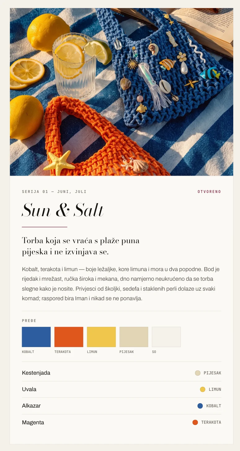
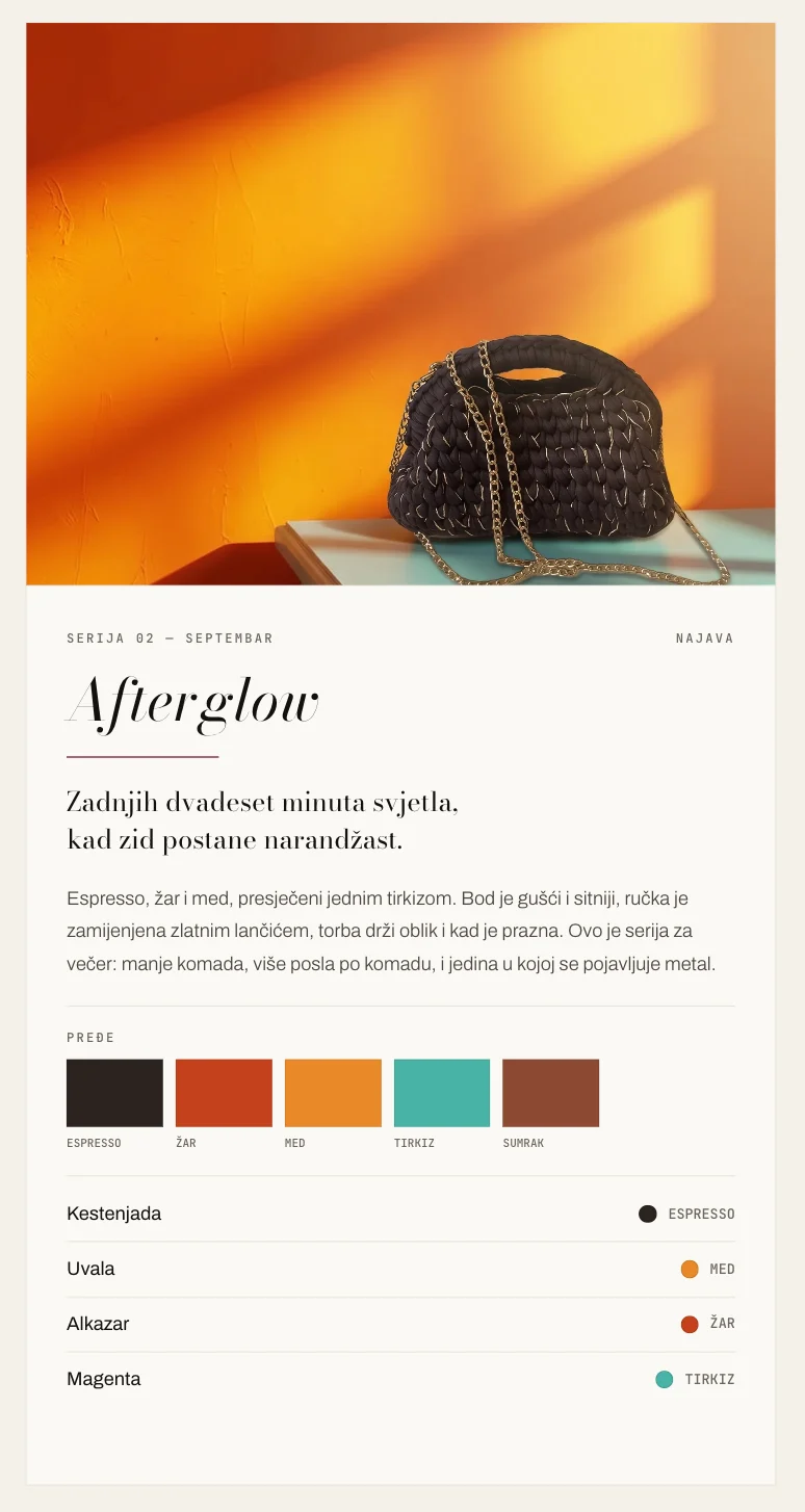
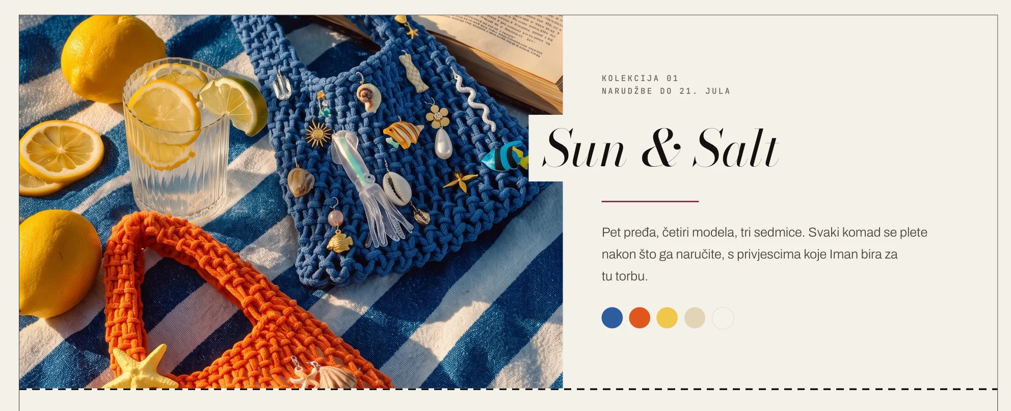
Crochê makes hand-crocheted bags in Sarajevo. The project brings its identity, collection and ordering experience together, with a back office built around the maker’s day.
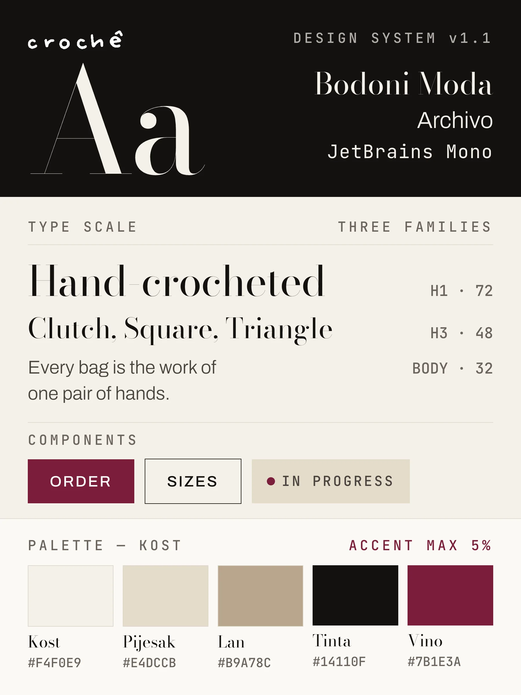 Design system
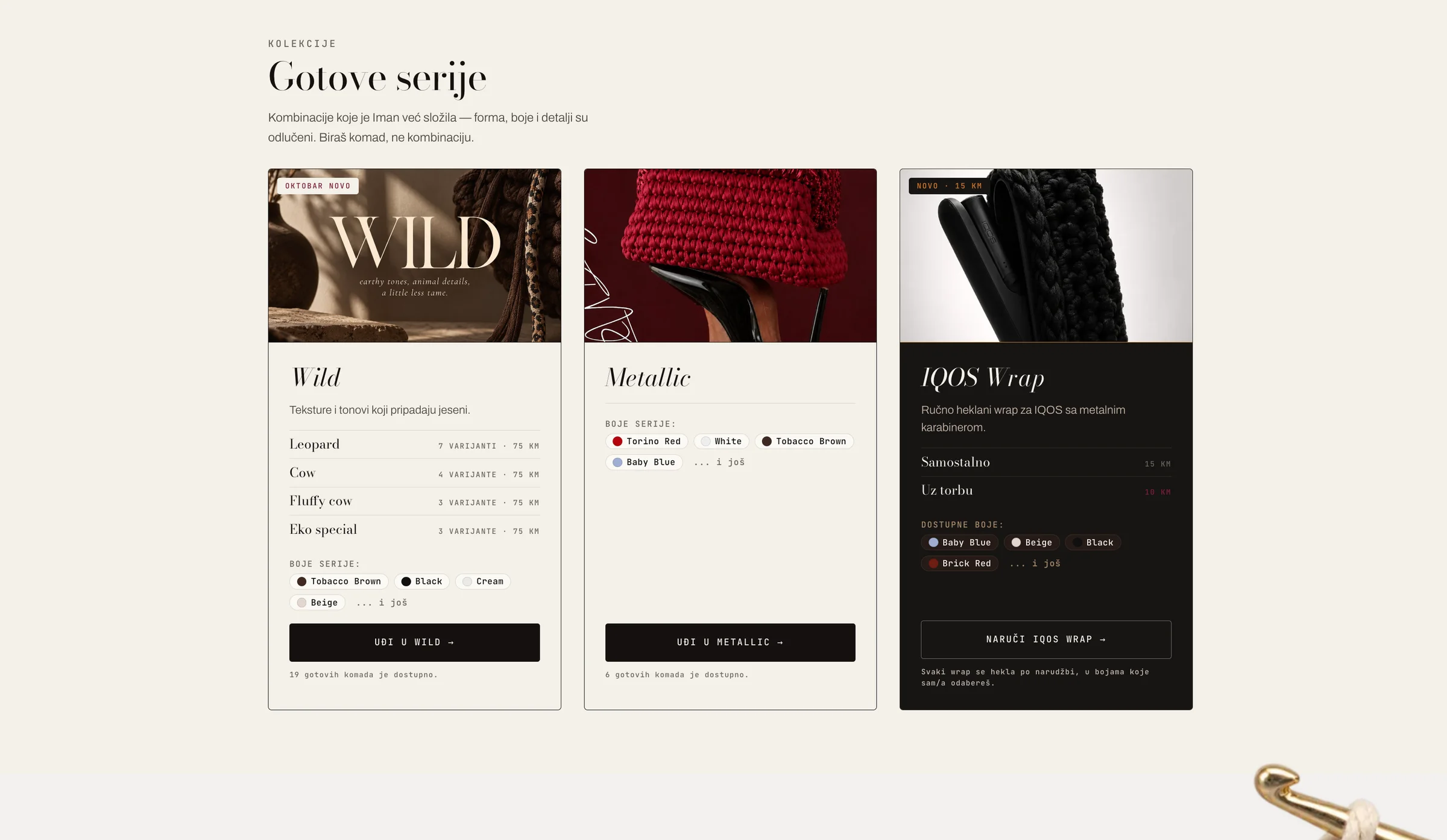
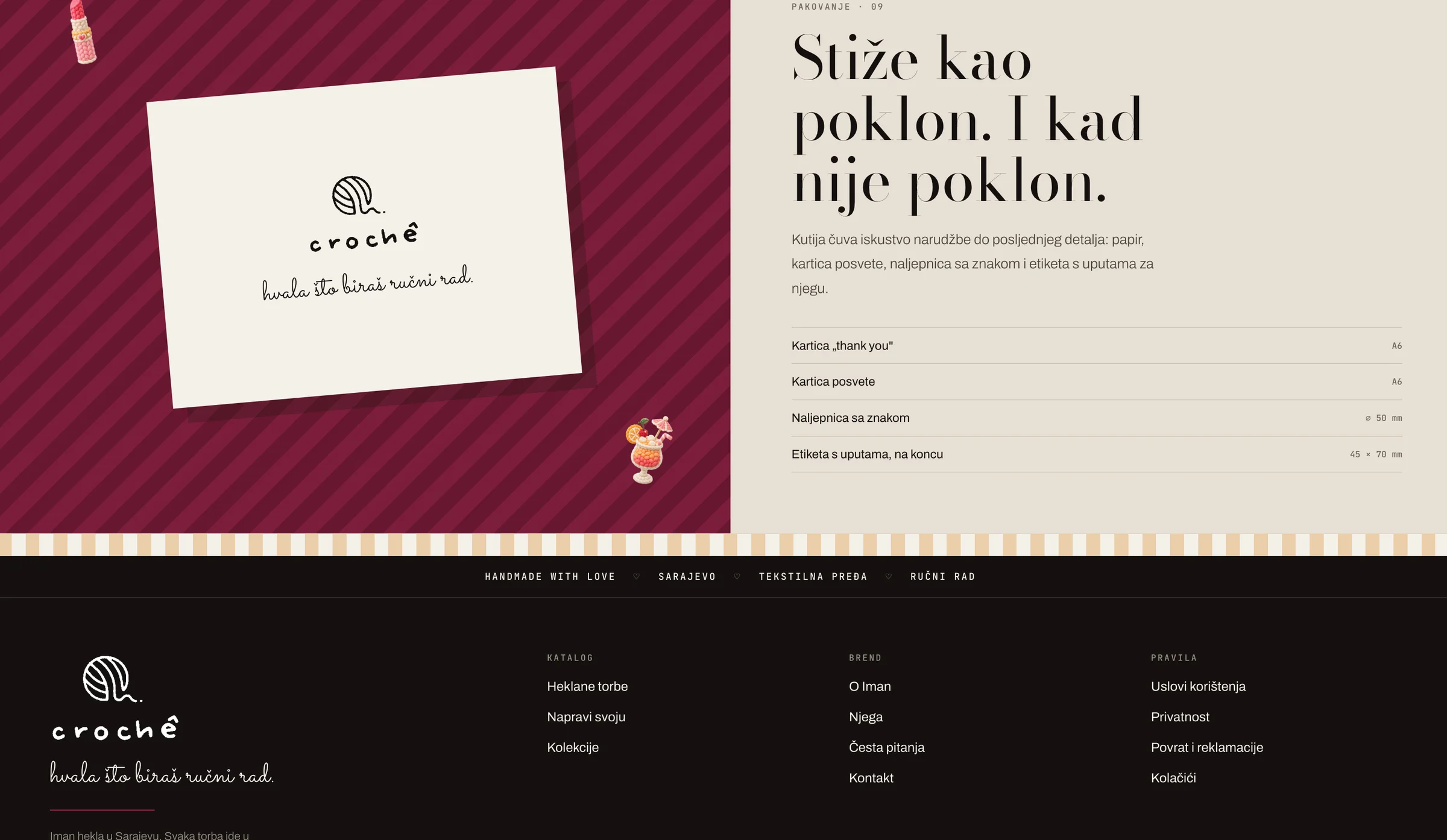
A look that carries through
A wine accent, Bodoni for the names and monospaced prices give the collection a consistent voice, from the shop to the customer emails and printed tags.
An order that feels personal
Customers choose a model, a size and up to three yarn colours. The bag preview changes with their choices, while the price stays in view.
Tools for the person making it
The owner panel brings the catalogue and orders together. Stock and model availability can be updated without waiting on a developer.
For your business
Built for Crochê. Shaped for you.
Orders that fit the product
- For Crochê
- Customers choose a model, a size and up to three yarn colours, and see the price as they go.
- For you
- The same flow can take a cake order by size and flavour, a bouquet by colour and stems, or a service with its add-ons.
You stay in charge
- For Crochê
- The owner updates stock and model availability directly, without waiting on a developer.
- For you
- Change a menu, a price list or your opening hours yourself, the same day.
One look, everywhere
- For Crochê
- The same type and colours carry from the shop to the customer emails and printed tags.
- For you
- Your site, your confirmations and your printed pieces read as one business.
The same approach fits
- Bakeries
- Cafés
- Barbers
- Salons
- Dental clinics
- Restaurants
- Boutiques
- Florists
- Gyms
- Hotels
- Retail chains
Reference 02 / 04
Una Adventure
The river sets the direction.
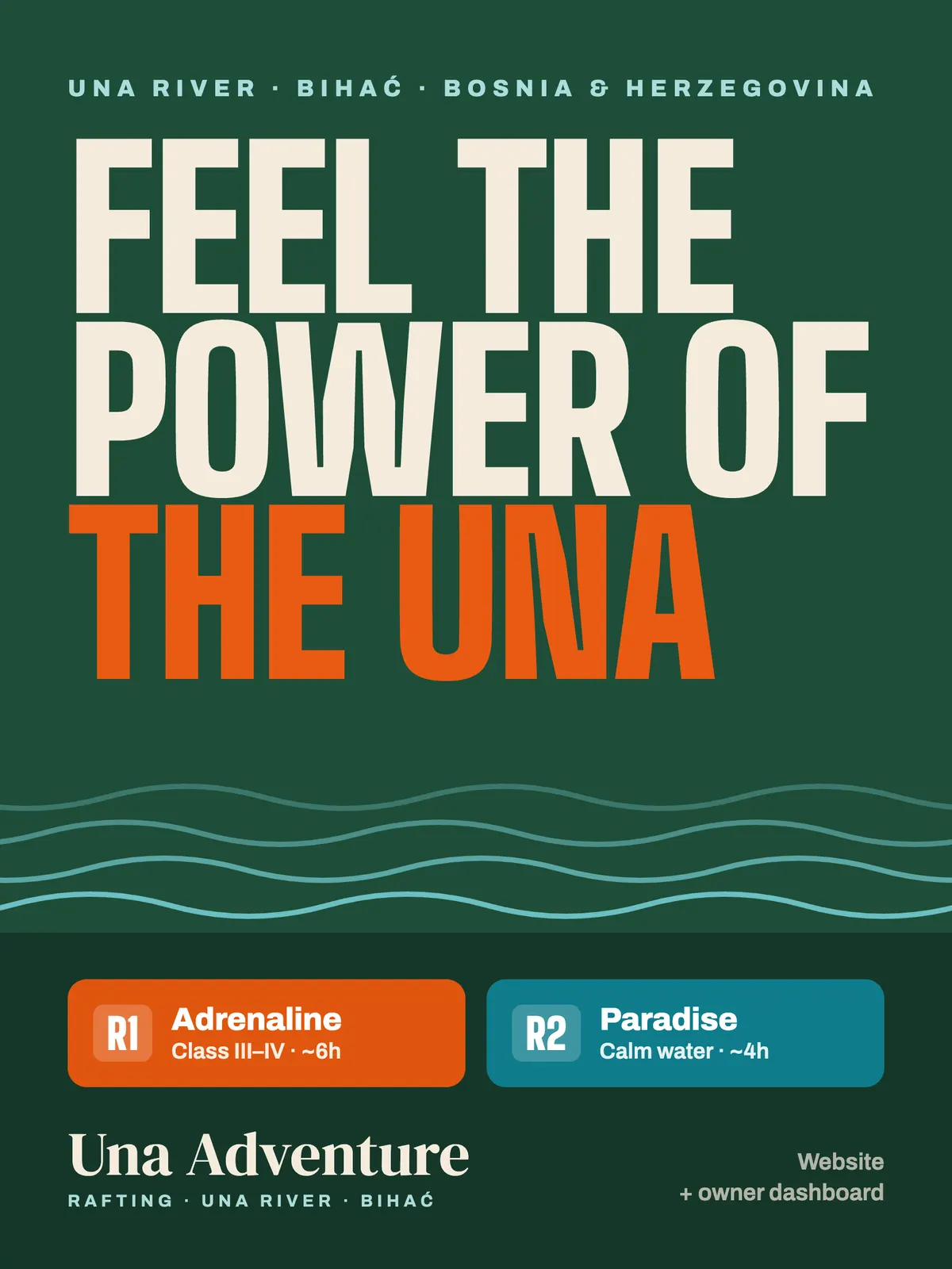
A website and owner dashboard for Una Adventure, a rafting business on the Una River in Bihać, Bosnia and Herzegovina. The visual direction takes its cues from the water and the outdoors.
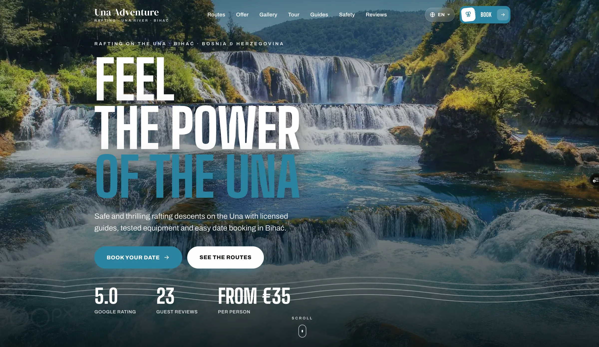
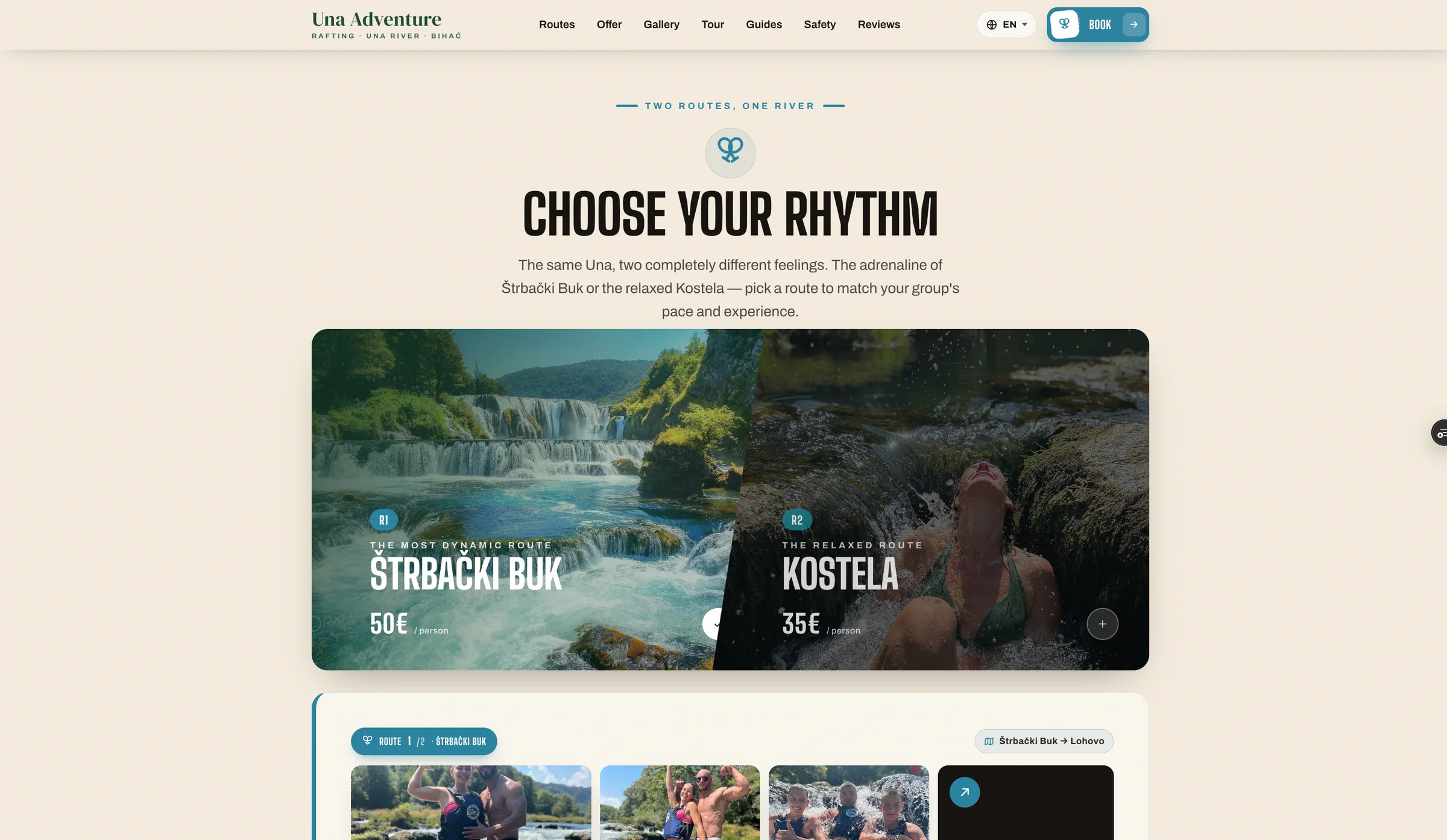
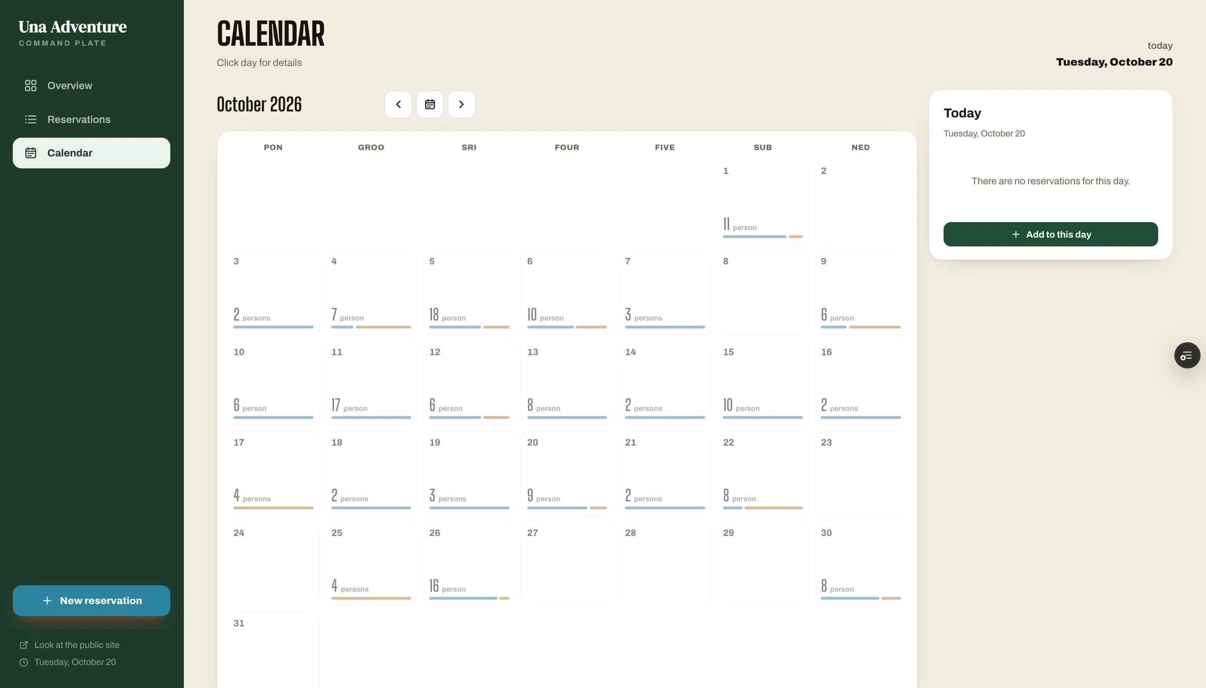
A sense of the place
Forest green, aqua and an orange accent bring the landscape into the design. The line “Feel the power of the Una” puts the river at the centre.
Two ways onto the water
The showcase introduces the Adrenaline and Paradise routes with distinct colours, giving each experience its own place in the visual system.
Website + owner dashboard
The project pairs the customer-facing website with an owner dashboard, bringing the visitor experience and the business side into the same project.
Reference 03 / 04
Tierd
A small mark with a clear point.
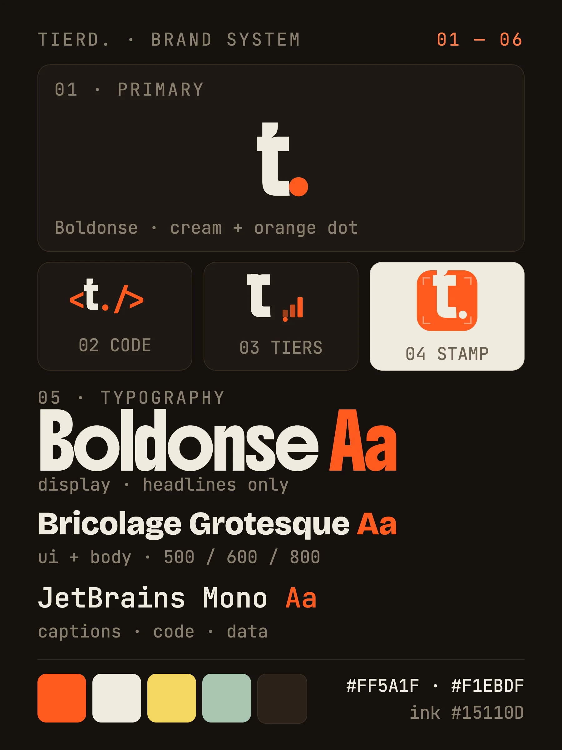
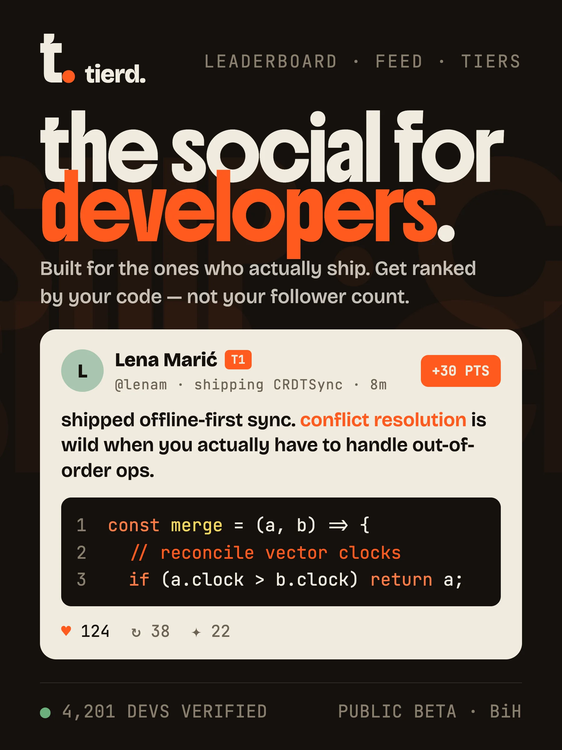
Tierd is a ranked dev platform. Its showcase uses a compact “t.” mark, warm neutrals and a sharp orange accent to give the name a distinctive presence.
- Ground
#15110D - Lettering
#F1EBDF - Dot
#FF5A1F
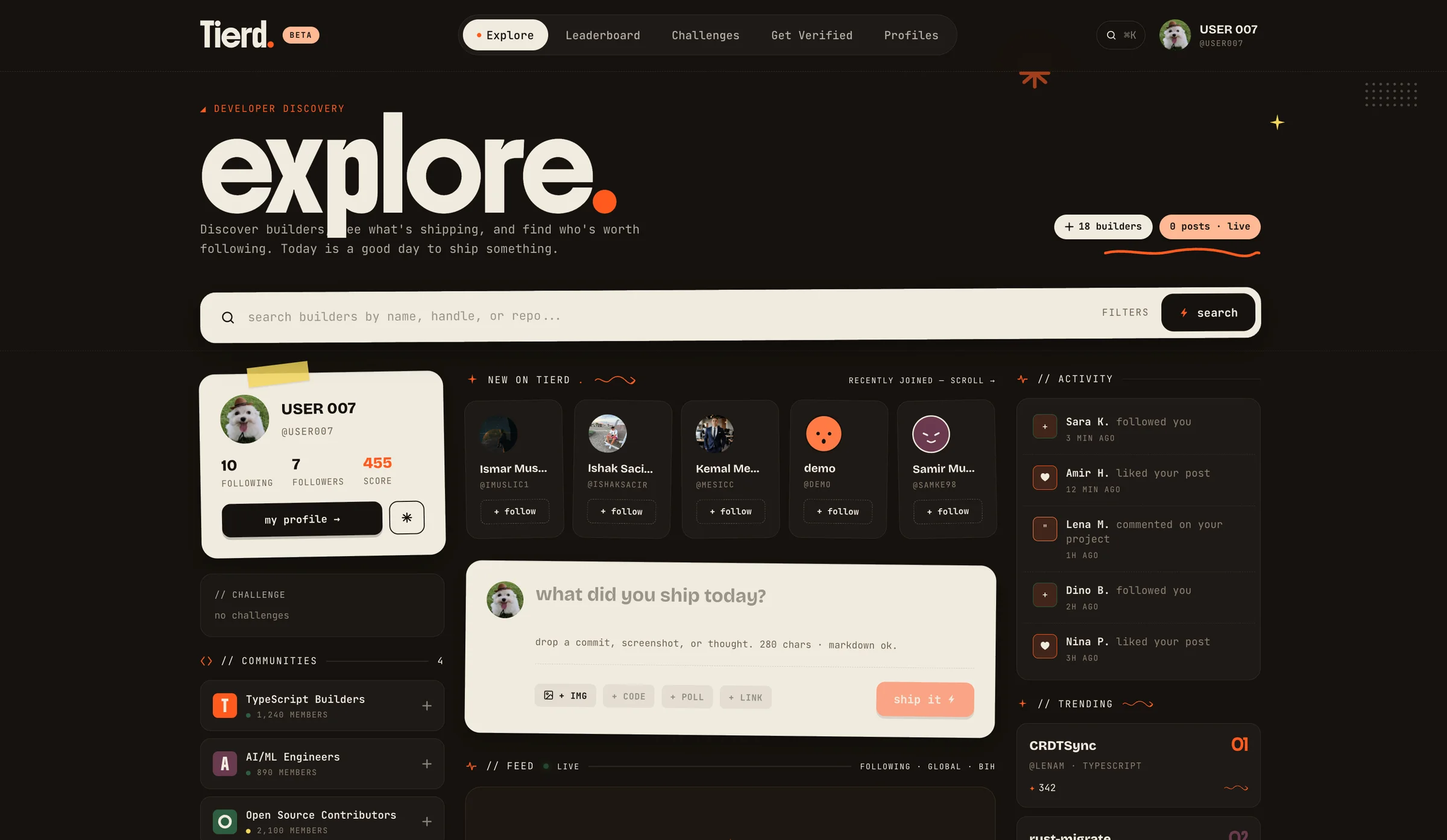 Explore

 The ranked dev platform
 Brand system
 Homepage
The mark
The lowercase “t.” is the focal point. Its orange full stop carries the accent into a compact form that also works in the corner badge.
The palette
Warm, light lettering sits against a dark brown background. Orange is reserved for the dots, keeping the emphasis precise.
The composition
The mark, the Tierd name and “The ranked dev platform” form a simple vertical stack, with space around each element.
Reference 04 / 04
Captured
An unexpected point of view.
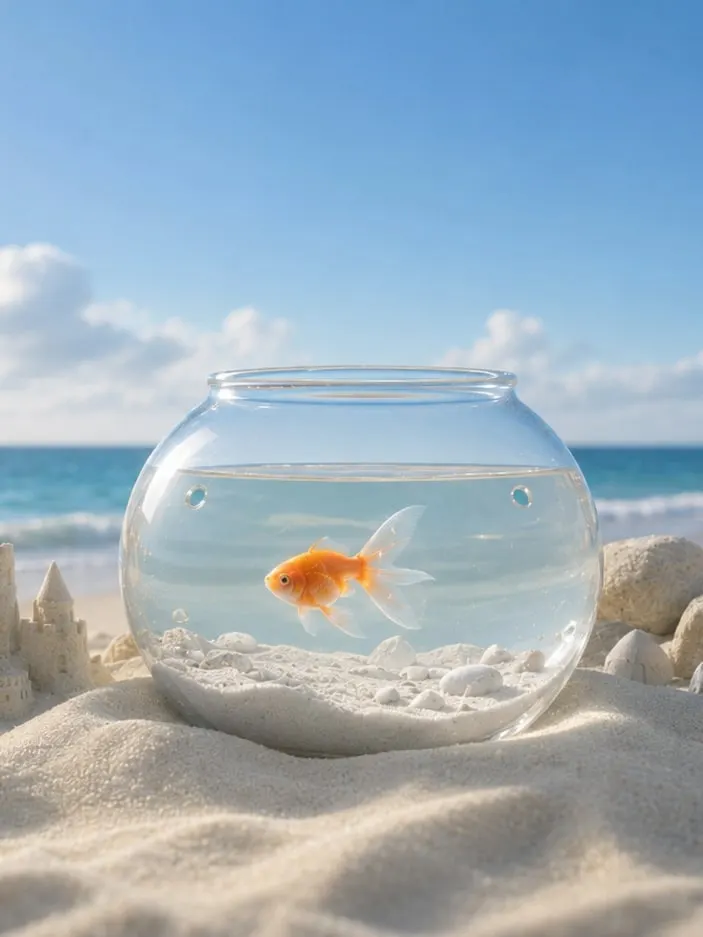
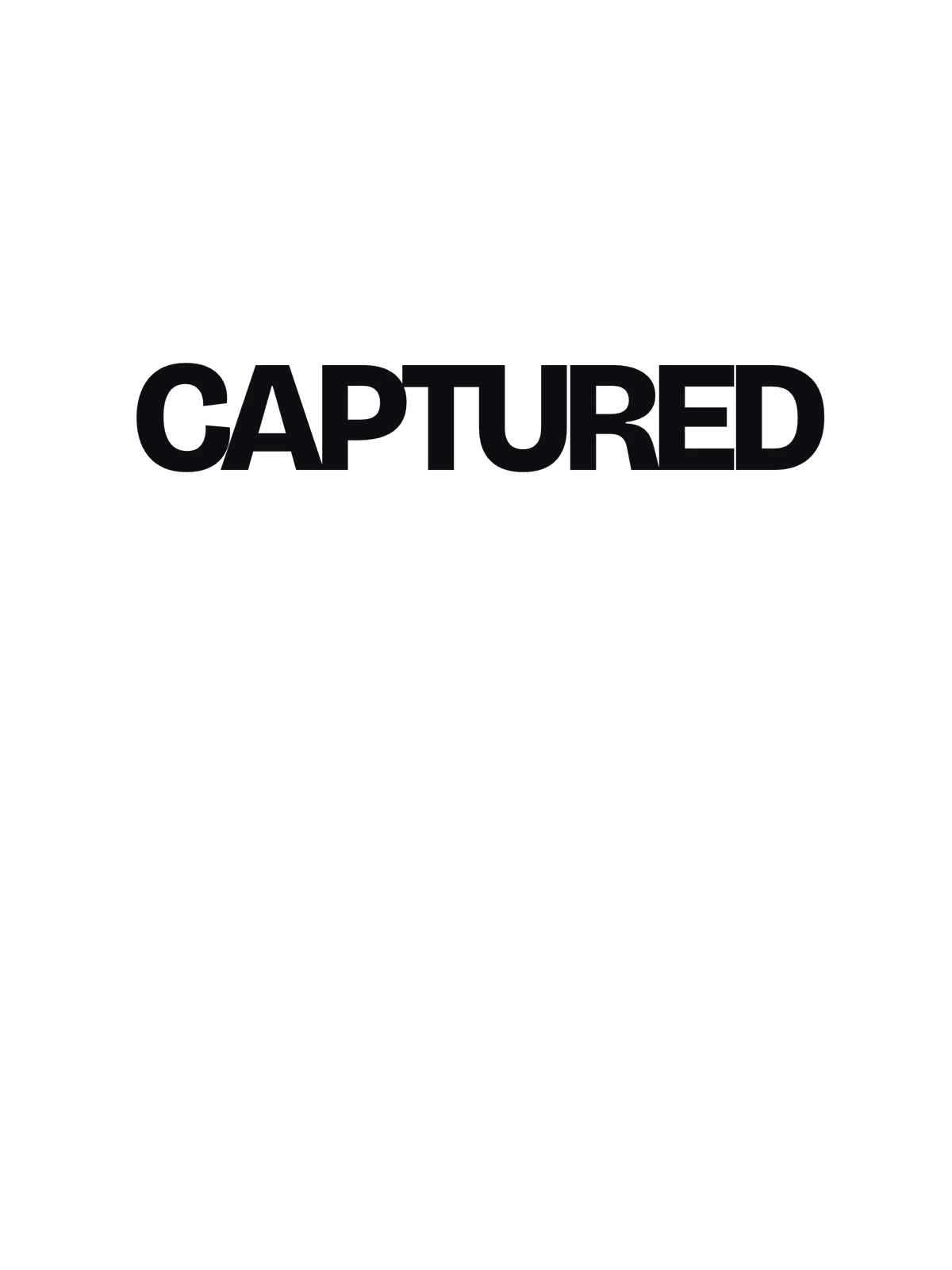
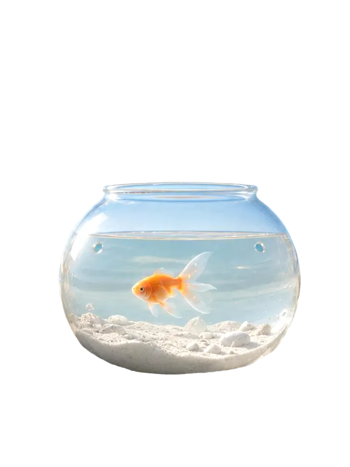
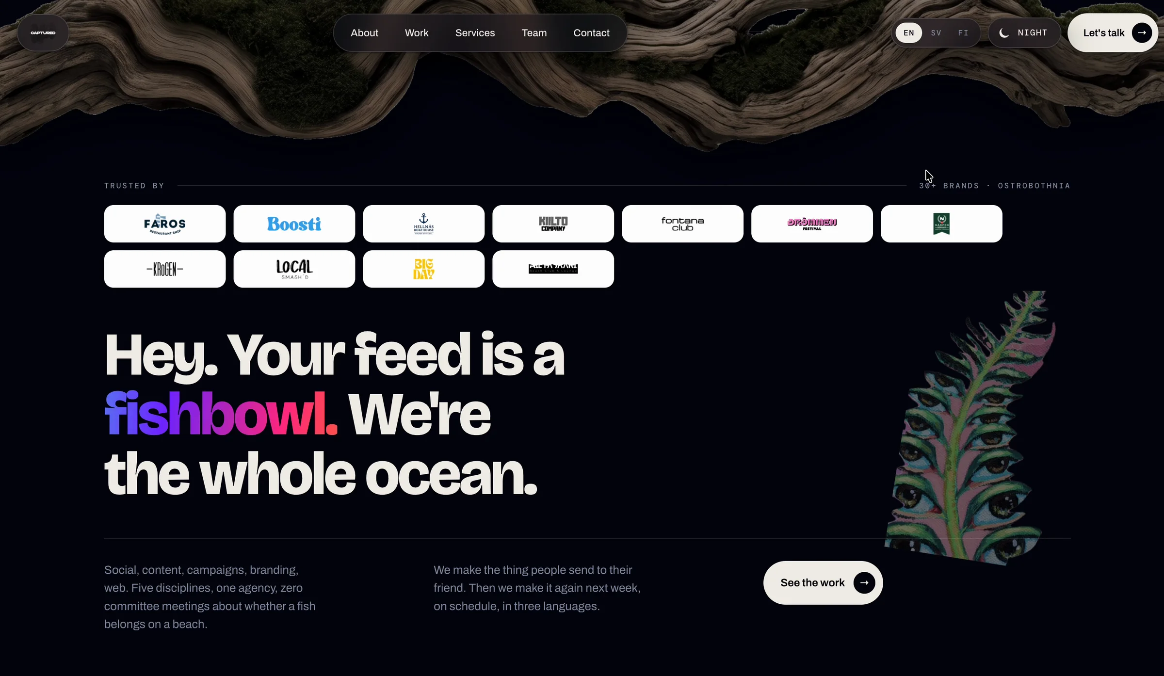
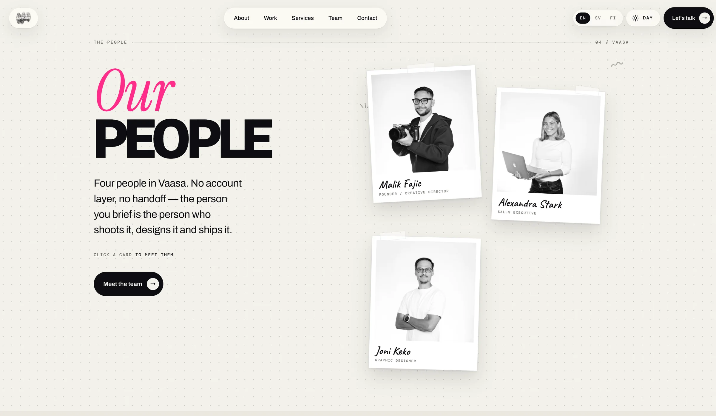
Captured is a creative agency in Vaasa, Finland. Its showcase brings a sunny beach, a fishbowl and a bold wordmark into one playful composition.
A scene to remember
The fishbowl is the focal point of an otherwise familiar beach scene. That unexpected detail gives the composition its character.
A name in the frame
Viewfinder corners frame the Captured wordmark. The bowl sits in front of the lettering, adding depth to the image.
A small signature
A pink corner and matching dot add a restrained accent. The caption anchors the scene with the agency’s name, field and location.